Fire Map: An exploratory visualization tool for analyzing spatio-temporal trends in forest fires.
|
December 2014
|
ABSTRACT
Wildfires have an important ecological role in the western United States and are becoming a popular area of study by scientists. Fire Map, a visualization tool of fire data, will display wildfire locations and sizes using graduated symbols that are proportional to acres burned. The data was collected from the Federal Wildfire Occurrence website, which is a conglomeration of fire data among numerous governmental agencies. By animating the data, we hope to reveal patterns of wildfire movement across this region. Users can filter the fire data by month and type, allowing for pattern identification and the removal of fire data that is not of interest. Details on demand can be obtained through the use of a mouse over pop-up window, which lists the number of acres burned, the start and end date, the agency who reported the fire, among other attributes. In short, our map will aid in the visualization of wildfire movement through space and time in the western United States.
Keywords: Wild fire, migration, interactive map, burned acreage, National Parks, western United States.
Index Terms: Web-based interaction, Interactive learning
environments
1. Introduction:
Wildfires are an important control on successional patterns in many different ecosystems, and the regional location of these fires migrates seasonally across the western United States each year [6]. Although wildfires are helpful to the environment, they can be very dangerous for developed areas with many buildings and inhabitants.
According to the National Interagency Fire Center, wildfires can be started a variety of different ways including by humans or by a natural occurrence such as a lightning strike from a storm. Some common types of human activity that create fires include a campfire that was not properly extinguished or a person throwing lit cigarettes into dry brush. Fires are not disasters that are predictable like a flood that will spread outwards from a body of water, they are something that will start in one area and will spread wherever possible with the right conditions [4].
Krawchuk et al. (2009) defines pyrogeography as the study of the spatial distribution of fire across space. The western part of the United States is prone to wildfires because they witness some of the hottest, driest summer seasons. This region also has a substantial amount of forested areas that house fire fuels. Whenever a small fire turns into a wildfire, it is very dangerous because it is not containable, hence the term “wild”. These fires are known to spread very rapidly across hundreds of acres lasting days on end. To facilitate understanding of wildfire trends over space and time, we will display wildfire geographic locations and acreage burned using graduated circles at point locations from the year 2007 to 2012. The graduated circles will be used in order to represent the fact that these fires often cause damage to hundreds of acres of land. Larger circles will represent larger areas burned and the smaller circles will show smaller areas burned.
2. Literature Review:
Much of our interface design is based upon the concepts about challenges of map animation design explained by Harrower (2003). Of the methods of selection described by Harrower, we find filtering and brushing to be the most promising for allowing users to specify smaller sets of fires from the thousands that are represented on our map. Temporal (annual) brushing in particular could be used on a histogram so that quantity and area of fires could be seen more easily. From the forms of temporal change discussed in the paper, we chose animation, with a focus on the appearance of only a small group of fires (e.g. fires that occurred in a specific month) to be the most effective for our massive point data [5]. A similar concept is the temporal query tool, the
TEMPEST time wheel, mentioned in Andrienko and Andrienko's 2003 paper. This tool allows users to select a date based on year, month, and day. While this tool provides the ability for users to navigate through the data based on specific dates, it may provide too precise of a repeating time frame for users to choose. This may prevent the users from seeing the progression of the data over a large period of time [2]. After consulting with Dr. Erica Smithwick, a fire ecologist in the Penn State Geography department, we decided that binning fires by month would provide appropriate temporal precision to see patterns [10]. The time wave interface discussed by Li and Kraak provides a solution on how to represent repeating seasonal changes as well as show the linear progression of time from month to month. Implementing a timewave is one of many features we will consider adding after the basic functionality of our program is working [7].
We utilized ideas discussed by Andrienko and Andrienko on how to geographically represent the data within a specific time frame. The practice of representing numerical data alongside nominal data as a shaded area with a superimposed graph was the most useful to our application. Specifically, this could be useful when we intend to combine fire burn acreage with the cause of the fire (human or natural) [1]. Instead, taking user opinion results on their most desired map symbology from Slocum’s evaluation of Map Time, the use of proportional circles to represent acreage burned should be the most user intuitive. Although this geometric symbol represents a high level of abstraction [8], its wide usage and simplicity make it the optimal symbol to use to represent individual fires in our animated, web-based map.
3. Client:
This map’s intended audience is students enrolled in the Global Sustainability and International Parks course at Penn State University. The course is divided into multiple sections relating to sustainability and parks, and one hazard that directly affects national parks yearly is wildfires, especially in the west. FireMap will provide an interactive learning experience by showing how frequent and intense these wildfires are, in addition to allowing the detection of spatial and temporal patterns in the fire spread. One learning objective of the course is to identify key drivers of future ecological change affecting park managements. This map displays one of several of those drivers, and by interacting with the map, students can assess how frequent fires occur within each park on a 7 year time scale. Also, as the students learn more about the locations of different national parks, they can refer back to this map animation to see how often that park is affected by wildfire. Overall, we believe that this map will be a great learning tool that can be implemented into the course.
4. Data sources:
Our data will be collected from the Federal Wildfire Occurrence website which lists the spatial location of the origin of each fire as a single point, along with many other fire attributes. These attributes include the specific date on which the fire started and ended and the total area burned. To a lesser extent, the data provides incomplete information on whether the fires were caused by human or natural sources. The data comes from all the recorded wildfire incidents from The Bureau of Indian Affairs (BIA), Bureau of Land Management (BLM), Bureau of Reclamation (BOR), United States Forest Service (USFS), Fish and Wildlife Service (FWS), and the National Park Service (NPS). The complete data set spans from 1980 to 2012. When unfiltered, the full data contains over 600,000 points within the entire US. The file itself can be downloaded in either a shapefile format or a geodatabase format, and the files can be downloaded as a whole or according to the specific organization (eg. USFS) that created the data.
5. Application Description:
Through the use of our interactive map, we hope to reveal seasonal shifts in location of the most fires across the western United States from New Mexico, north to Montana, and westward to the Pacific Ocean. We have incorporated a variety of user controls to our map display, enabling the user to filter the data, in addition to generate details on demand. Each fire event is depicted by a circular, graduated symbol, and its location will correspond to the approximate center of the fire event and its size relative to the number of acres burned. We selected five classes of circles, using a natural breaks classification scheme. Through the use of a query box, the user is able to filter the data by month and year to select a subset of data of their choosing. The fire events will be aggregated by the month of each year ranging from 2007-2012. Through the use of a pop-up window, a user can generate details on demand by mousing over a circle of interest. The window will list fire event attributes including the number of acres burned, the type of fire (i.e. controlled burn, appropriate management response (AMR), prescribed fire, false alarms, and miscellaneous incident), and the start and end date. In addition, the National Parks are shown in green on the map, and the name of the park will appear in the upper right hand corner of the display if moused over.
Users can filter the data in one of two ways: they can choose to view only one of two fire types, either naturally caused or human caused, or they can choose to view only a subset of the data, by choosing a range of dates from January 2007 to December 2012. The animation will display fires by month, for the data range and type selected by the user, and loops after the animation plays through once. At this point, the rate of change or speed of the animation cannot be controlled by the user, although we would like to implement that type of control in the future. Through the application of the controls and interactions, we hope that our map will aid in the visualization of wildfire distribution through space and time in the western United States. (Figure 1) shows the map display and numerous interaction tools.
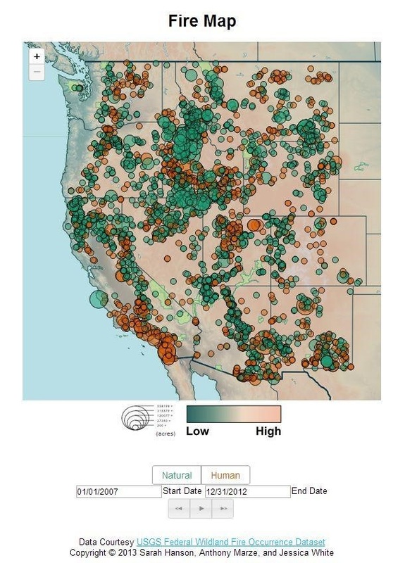
Figure 1: A screenshot of the Fire Map application.
Click HERE to see a demo of FireMap. (YouTube)
ACKNOWLEDGEMENTS:
We would like to thank Dr. Alan MacEachren for the opportunity to design this wildfire application. If you are interested in viewing other GEOG461W Final Projects, click here. The interface would not have been possible without the generous efforts and expertise of Ryan Mullins in visualization and execution of the data into the final working product. Lastly, we would like to thank Dr. Erica Smithwick for allowing us to implement this map as a learning tool in her Geography 097 class entitled Global Sustainability and International Parks, and for identifying the need for such a map in the first place.
REFERENCES:
[1] Andrienko, G. L. & N. V. Andrienko. 1999. 'Interactive maps for visual data exploration', International Journal of Geographic Information
Science, 13(4), pp. 355-374
[2] Andrienko, N., Andrienko, G., & Gatalsky, P. 2003. Exploratory spatio-temporal visualization: an analytical review. Journal of Visual Languages & Computing, 14(6), 503-541.
[3] "Causes of Forest Fire." -- Replanting America's National Forests at
Arborday.org. National Interagency Fire Center, n.d. Web. 21 Mar. 2013.
[4] Cohen, Jack D. 2000. What is the Wildland Fire Threat to Homes? Presented as the Thompson Memorial Lecture.
[5] Harrower, M. 2003. Tips for Designing Effective Animated Maps. Cartographic Perspectives(44), 63-65.
[6] Krawchuk MA, Moritz MA, Parisien M-A, Van Dorn J, Hayhoe K
(2009) Global Pyrogeography: the Current and Future Distribution of Wildfire. PLoS ONE 4(4): e5102. doi:10.1371/journal.pone.0005102
[7] Li, X. & Kraak, M.J. 2012: Explore Multivariable Spatio-Temporal
Data with the Time Wave: Case Study on Meteorological Data. In
Guilbert, E., Lees, B. and Leung, Y., editors, Joint International Conference on Theory, Data Handling and Modeling in GeoSpatial Information Science, Hong Kong: ISPRS, 575-580.
[8] MacEachren, A. M. 1995. How Maps Work: Representation, Visualization and Design. New York: Guilford Press; selected pages
[9] Slocum, T., R. Sluter, F. Kessler, & S. Yoder. 2004. 'A Qualitative Evaluation of MapTime, A Program For Exploring Spatiotemporal Point Data', Cartographica, 39(3), pp. 43-68.
[10] Smithwick, E. (2013, March20). Email interview. [11] USGS. "Federal Fire Occurrence Website." Federal Fire Occurrence Website. USGS, 25 Feb. 2013. Web. 21 Mar. 2013.
[12] Westerling, A., & B. Bryant. 2006. Change and wildfires around California: Fire modeling and loss modeling.Sacramento, CA: California Climate Change Center.
